Like pricing cards,
Cards could have or not the media header
- Image
- Icon – T2, configurable in t2.json (see below)
- none
On mobile it become an slider
Cards allow set custom colors, support for native blogGap, and custom Featured card color per card.
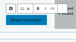
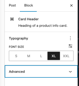
Each element suport many of native controls form wordpress, e.g You’re able to change badge color using native bg select.
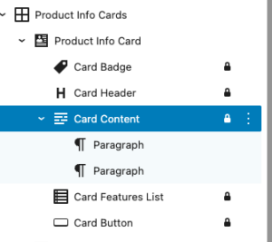
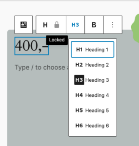
Each element in card is an inner locked block which allows easy override for block and hooking into it in case it is needed.
Editor

Design in Neas
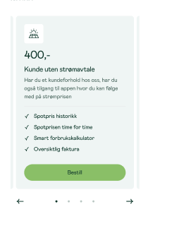
Mobile carousel: At viewport widths ≤ 640 px the grid automatically becomes a Swiper carousel — one card visible at a time with pagination dots and prev/next arrows. The carousel is initialised on DOMContentLoaded and re-evaluated on window resize (debounced 150 ms): it is destroyed when the viewport exceeds 640 px and re-created when it drops back below. Requires at least 2 cards in the block. Swiper parameters can be customised via the dekode-library/product-info-cards/swiper-config PHP filter.
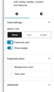
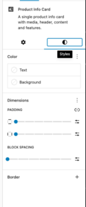
- Featured card toggle with custom background/text colour
- Media type selector:
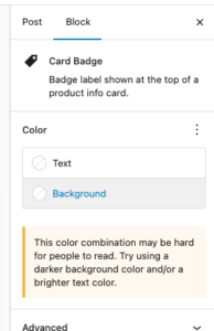
none|image(icon reserved for future use) - Badge toggle (show/hide)
- Background colour, text colour
- Border: colour, width, style, radius
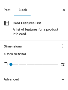
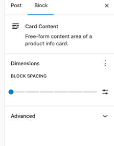
- Spacing: padding, blockGap
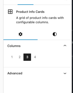
- Responsive column grid (1–4 columns, configurable)
- Block alignment: wide, full
Library json config
The features can be show/hidden and adjust using library.json
dekode-library/product-info-cards
| Key | Type | Default | Description |
|---|---|---|---|
layout.defaultColumns | number | 3 | Initial column count applied on first block insertion |
layout.columns | number[] | [1,2,3,4] | Which column options appear in the inspector |
dekode-library/product-info-card
| Key | Type | Default | Description |
|---|---|---|---|
features.allowBadge | boolean | true | Show the badge toggle in the inspector. When false the badge sub-block is never inserted |
features.featuredColors | boolean | true | Show the Featured colours panel in the inspector |
features.mediaType | string[] | ["none","icon","image"] | Restrict available media type options. A single-item array forces that type silently on first insertion |
layout.imageSize | string | "large" | WordPress image size used when rendering the card media image. Any registered size name is accepted (e.g. "medium", "full", "my_custom_size"). Can be further overridden by the dekode-library/product-info-cards/card-media/image/size PHP filter |
layout.iconSize | number | 32 | Size in pixels for the card media icon (T2 icon). Can be further overridden by the dekode-library/product-info-cards/card-media/icon/size PHP filter |
settings.colors.featuredBackgroundColor | string | object | null | Default featured background. Plain string (hex/css), or { "color": "#hex" } / { "slug": "preset-slug" } |
settings.colors.featuredTextColor | string | object | null | Default featured text colour. Same format as above |
{
  "dekode-library/product-info-cards": {
    "layout": {
      "defaultColumns": 3,
      "columns": [1, 2, 3, 4]
    }
  },
  "dekode-library/product-info-card": {
    "settings": {
      "colors": {
        "featuredBackgroundColor": "#ff0000",
        "featuredTextColor": "#ffffff"
      }
    },
    "features": {
      "allowBadge": true,
      "featuredColors": true,
      "mediaType": ["none", "image"],
      "imageSize": "medium_large"
    }
  }
}
For more info see plugin’s readme
Example
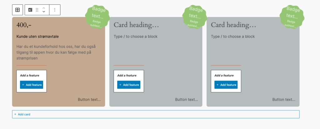
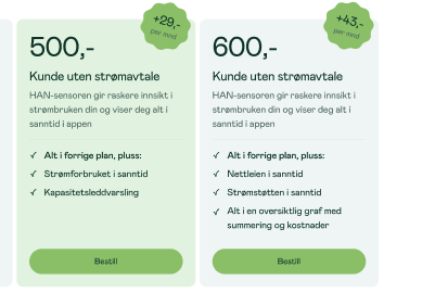
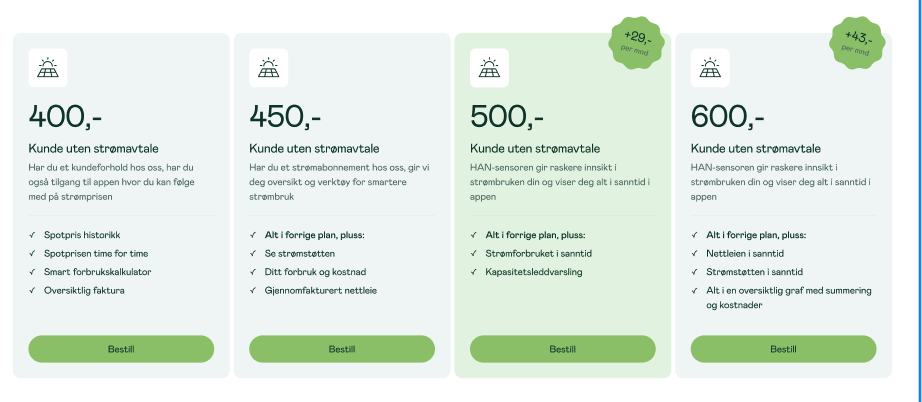
550,-
Kunde uten strømavtale
HAN-sensoren gir raskere innsikt i strømbruken din og viser deg alt i sanntid i appen
- Alt i forrige plan, pluss:
- Nettleien i sanntid
- Strømstøtten i sanntid
- Alt i en oversiktlig graf med summering og kostnader