Category: BlockLibrary

  • Post type scroll

    Post type scroll

    Show post types in a scrollable list. Based on the dekode.no scroll component.

    The block

    The block allows you to select posts or select post type and display assigned posts in a scrollable swiper based list.

    The block uses T2 Featured card layout to display the posts.

    The block allows to control

    • Post type to fetch posts from
    • Manually select posts
    • Exclude current post from query if post type is selected.
    • The number of posts to show
    • The number of posts to show in the slider
    • Show or hide the block title
    • Add custom more link
    • Placement of read more link (top/ bottom)
    • Read more button style – based on registered core button styles.

    Orginally developed for Litex, Examples usage stage: https://litex-2025.dev09.dekodes.no/

    See more info:
    https://github.com/DekodeInteraktiv/dekode-library/tree/main/library/post-type-scroll

  • QueryLoop: Featured Cards

    QueryLoop: Featured Cards

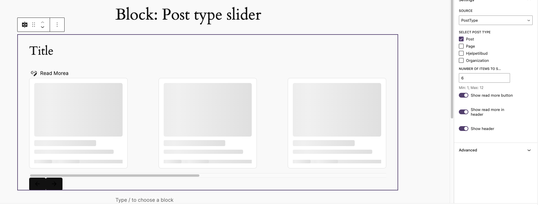
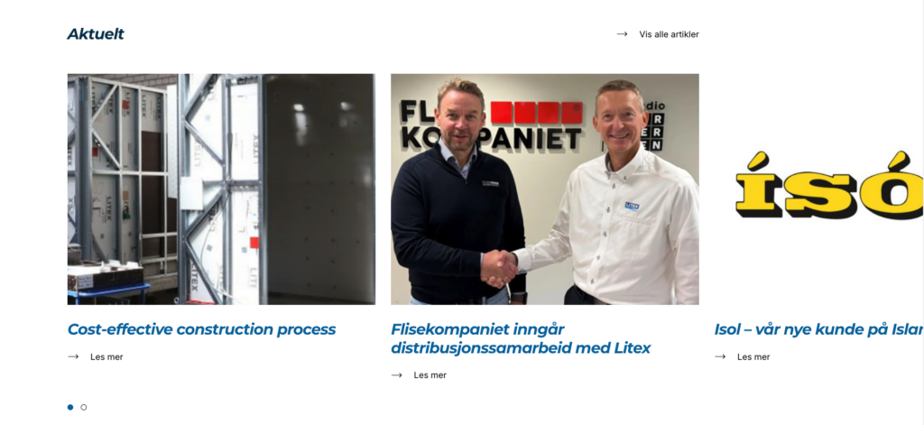
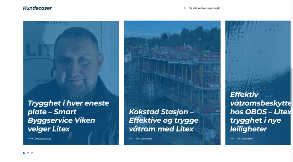
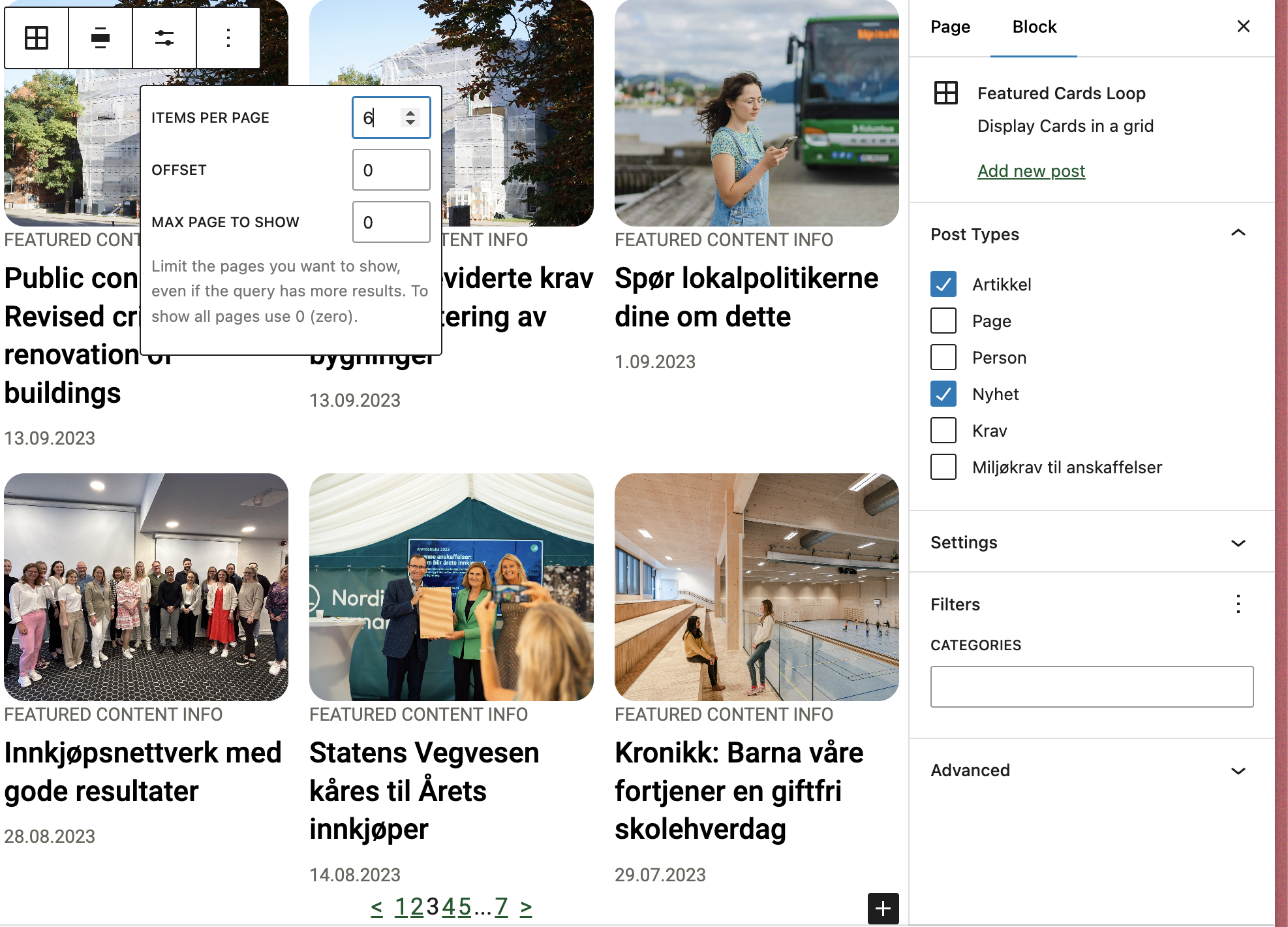
    Overrides the query loop block to work with T2 while also removing clutter. Supports multiple post types. Customizable through library.json.

    Customizing the block

    This block can be customized using the library.json file. The following options are available:

    • __experimentalMultiplePostTypes (bool): Whether to allow multiple post types. Default: false.
    • template (array): The innerblocks template.
    • allowedControls (array): The allowed controls for the block See list, To see the post per page use postCount to see full list of available controls see the code as documentation is not complete Link
    • defaultQuery (array): The default query for the block.
    • defaultVariationTitle (string): The title that will be outputted for the block.
    • defaultVariationDescription (string): The description that will be outputted for the block.
    • allowedColumns (array): The allowed columns for the block.

    See more details: https://github.com/DekodeInteraktiv/dekode-library/tree/main/library/featured-cards-loop

  • Image Step guide

    Image Step guide

    Wrapper block for step-by-step content with image on one side and editable inner blocks on the other.

    By default te plugin has no styling, it requires one.

    Styled screenshots are from see stage Example

    Features

    • displayType driven by library.json
    • optional editor switch for displayType
    • step content supports configurable allowed blocks and templates
    • native WordPress blockGap support on the wrapper
    • native WordPress Background and Text color support on the step block
    • step label prefix and visibility, configurable from library.json
    • image lightbox support (requires WordPress 6.4+), configurable from library.json

    See more info in docs: https://github.com/DekodeInteraktiv/dekode-library/tree/main/library/image-step-guide

  • HubSpot Form

    HubSpot Form

    Easily embed HubSpot Forms without having to enable Custom HTML block to copy paste the script.

    The plugin adds HubSpot block.

    See more info: https://github.com/DekodeInteraktiv/dekode-library/tree/main/library/hubspot-form

  • Dekode Post, Term and Meta Blocks

    Dekode Post, Term and Meta Blocks

    A WordPress plugin that provides blocks and block variations for rendering post propertiesterm properties, and meta fields directly in the block editor and on the front end. Per Egil Roksvaag is the owner of this plugin and responsible for maintenance and support.

    Reason Why

    WordPress ships with a set of post blocks (core/post-titlecore/post-excerptcore/post-featured-image, etc.) and a similar set of term blocks (core/term-namecore/term-descriptioncore/term-archive-link, etc.). Use these core blocks whenever they cover your needs.

    However, there are some cases where the core blocks fall short and you need enhanced features for displaying post, term or meta data:

    • Meta fields — Display registered post or term meta fields.
    • Additional properties — Show post and term properties not covered by core blocks, e.g. post type, post status or taxonomy name.
    • Display a post’s terms — Show term properties related to the current post in a term query loop or a single post template.
    • Display a term’s posts — Show post properties related to the current term in a term query loop or a single term template.
    • Post or term buttons — Render a post, term or meta field as a core button with dynamic text and link.
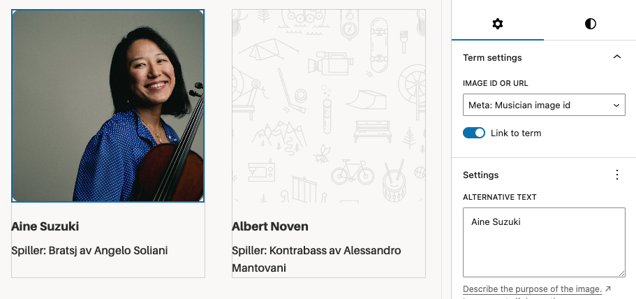
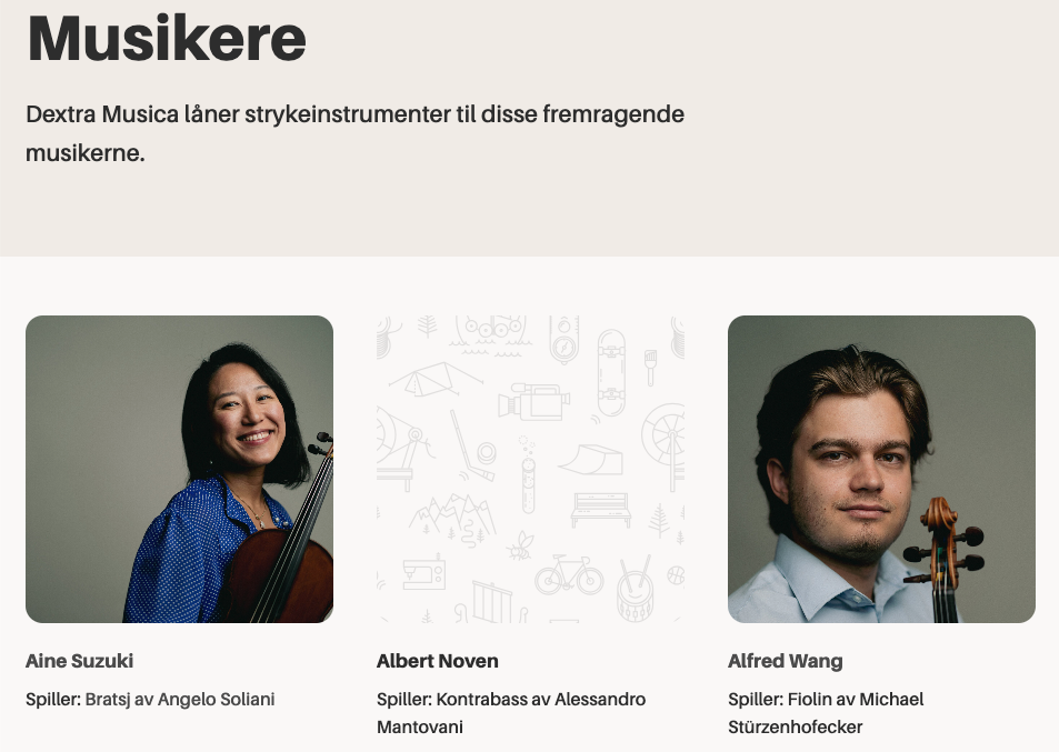
    • Post or term images — Render a post, term or meta field as a core image. In contrast to the core featured image block, it can display a fallback image when no featured image is set.
    • Filters and hooks — Backend and editor hooks for displaying custom properties or modifying the output.

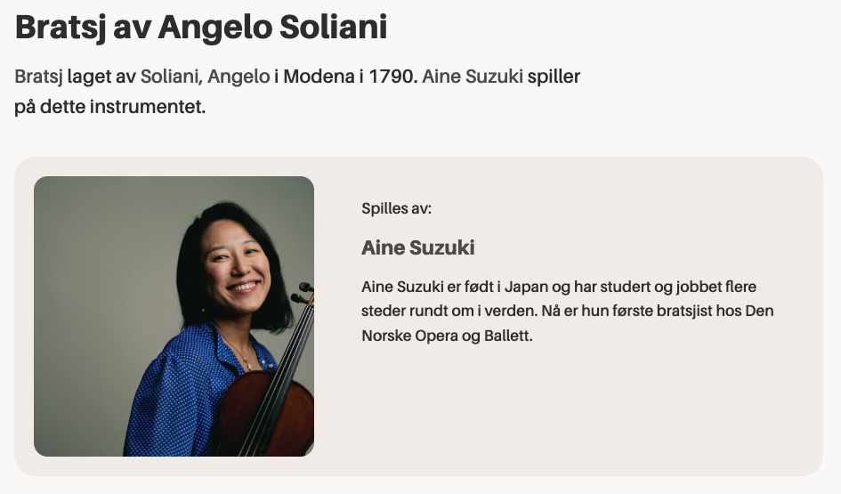
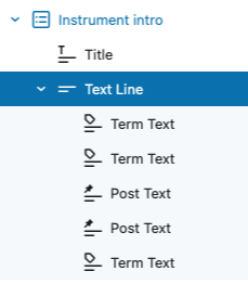
    This plugin also provides a Text Group helper block for combining multiple post or term properties into a single line of text. Inside the group, you can use the included Inline Text block to insert static text or separators between the dynamic properties.

    Blocks and Variations

    dekode-library/post-property-text

    Renders a single post property — title, excerpt, date, author, type, status, slug, link, featured image ID, or any meta field — as text. Supports prefix, suffix, separator, tag name, text alignment, and optional linking to the post. Server-side rendered.

    dekode-library/term-property-text

    Renders a single term property — name, description, archive link, slug, ID, count, taxonomy name, or any meta field — as text. Supports prefix, suffix, separator, tag name, text alignment, and optional linking to the term archive. Server-side rendered.

    dekode-library/text-group

    A layout container block for grouping multiple text property blocks. Supports inline and block layouts with configurable gap. Inner inline-text blocks can be nested freely within the group.

    core/button — Post Property and Term Property variations

    Two variations of the core Button block that replace button text and the link URL with a resolved post or term property. The button text and link are rewritten server-side via WP_HTML_Tag_Processor, preserving all block markup and editor styles.

    core/image — Post Property and Term Property variations

    Two variations of the core Image block that replace the image source with a resolved post or term property (e.g. featured_media or a meta URL field). Server-side rendered.
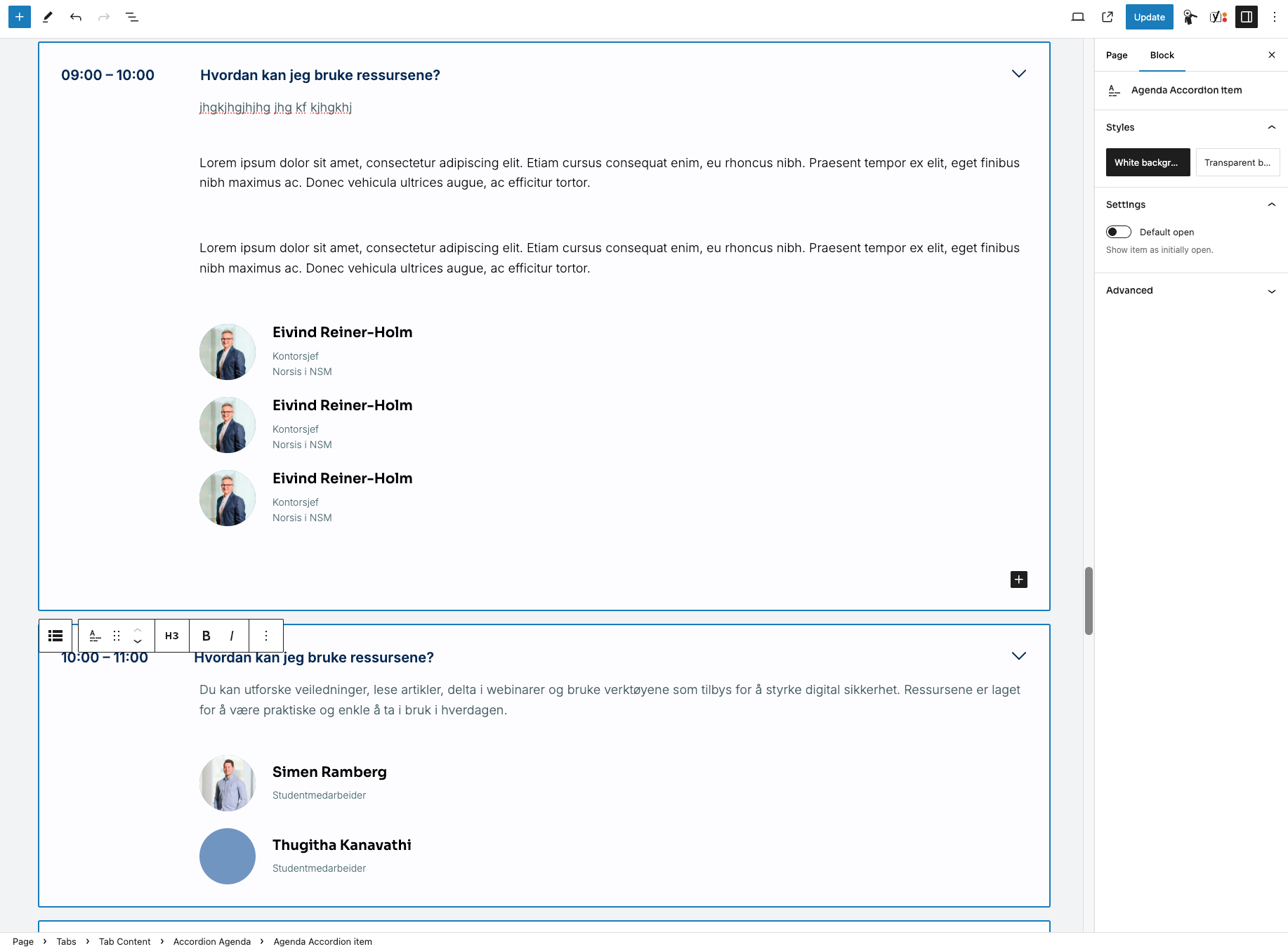
    For more details see docs:
    https://github.com/DekodeInteraktiv/dekode-library/tree/main/library/dekode-post-blocks

  • Agenda Accordion

    Agenda Accordion

    Simple block T2-accordion like but allows you to set Description and time (or any text on a side)

    Block is fully accessible and keyboard-navigation ready.

  • Chatbase integration

    Chatbase integration

    What it does

    There are 2 features provided by this plugin:

    • Add the chat bubble embed on the page.
      • This can be enabled or disabled per page. This can be adjusted in the page settings in the editor.
    • Adds Chatbase search widget Gutenberg block. This will place a search widget on the page that connects to the Chatbase chatbot.

    For more info see readme https://github.com/DekodeInteraktiv/dekode-library/tree/main/library/dekode-chatbase

  • Color card

    Color card

    Simple card with title text and link to set

    Also allows to select card color.

    Example usage in the DinUtvei project:

    https://dinutvei.no/

  • Info Product cards

    Info Product cards

    Like pricing cards,

    Cards could have or not the media header

    • Image
    • Icon – T2, configurable in t2.json (see below)
    • none

    On mobile it become an slider

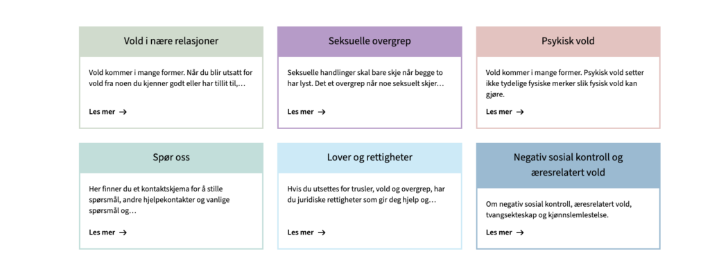
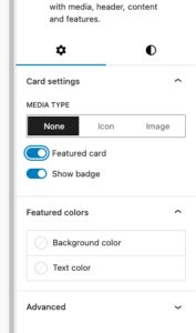
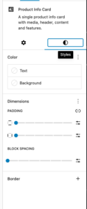
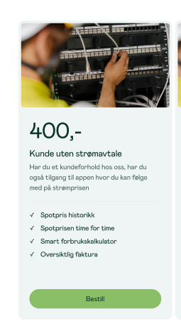
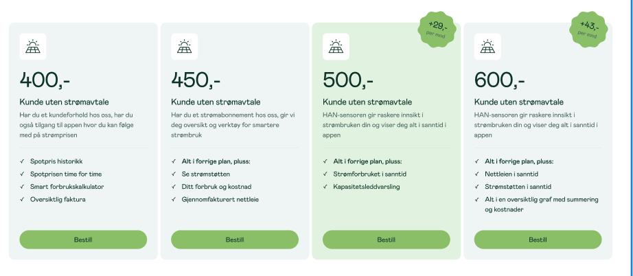
    Cards allow set custom colors, support for native blogGap, and custom Featured card color per card.

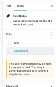
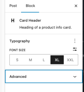
    Each element suport many of native controls form wordpress, e.g You’re able to change badge color using native bg select.

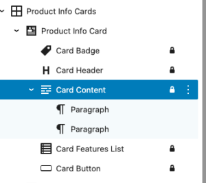
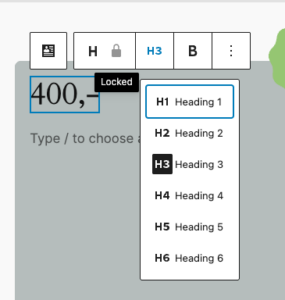
    Each element in card is an inner locked block which allows easy override for block and hooking into it in case it is needed.

    Editor

    Design in Neas

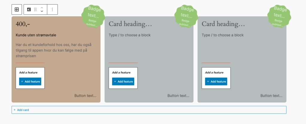
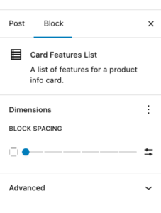
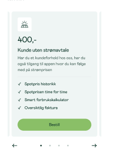
    Mobile carousel: At viewport widths ≤ 640 px the grid automatically becomes a Swiper carousel — one card visible at a time with pagination dots and prev/next arrows. The carousel is initialised on DOMContentLoaded and re-evaluated on window resize (debounced 150 ms): it is destroyed when the viewport exceeds 640 px and re-created when it drops back below. Requires at least 2 cards in the block. Swiper parameters can be customised via the dekode-library/product-info-cards/swiper-config PHP filter.

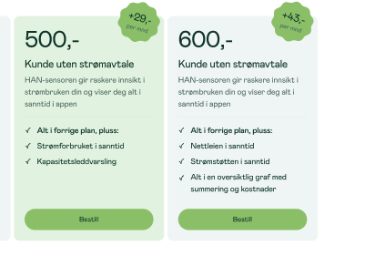
    • Featured card toggle with custom background/text colour
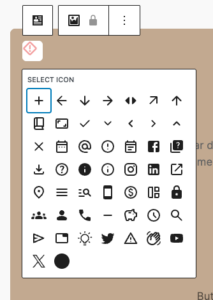
    • Media type selector: none | image (icon reserved for future use)
    • Badge toggle (show/hide)
    • Background colour, text colour
    • Border: colour, width, style, radius
    • Spacing: padding, blockGap
    • Responsive column grid (1–4 columns, configurable)
    • Block alignment: wide, full

    Library json config

    The features can be show/hidden and adjust using library.json

    dekode-library/product-info-cards

    KeyTypeDefaultDescription
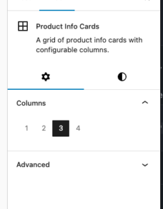
    layout.defaultColumnsnumber3Initial column count applied on first block insertion
    layout.columnsnumber[][1,2,3,4]Which column options appear in the inspector

    dekode-library/product-info-card

    KeyTypeDefaultDescription
    features.allowBadgebooleantrueShow the badge toggle in the inspector. When false the badge sub-block is never inserted
    features.featuredColorsbooleantrueShow the Featured colours panel in the inspector
    features.mediaTypestring[]["none","icon","image"]Restrict available media type options. A single-item array forces that type silently on first insertion
    layout.imageSizestring"large"WordPress image size used when rendering the card media image. Any registered size name is accepted (e.g. "medium""full""my_custom_size"). Can be further overridden by the dekode-library/product-info-cards/card-media/image/size PHP filter
    layout.iconSizenumber32Size in pixels for the card media icon (T2 icon). Can be further overridden by the dekode-library/product-info-cards/card-media/icon/size PHP filter
    settings.colors.featuredBackgroundColorstring | objectnullDefault featured background. Plain string (hex/css), or { "color": "#hex" } / { "slug": "preset-slug" }
    settings.colors.featuredTextColorstring | objectnullDefault featured text colour. Same format as above
    {
      "dekode-library/product-info-cards": {
        "layout": {
          "defaultColumns": 3,
          "columns": [1, 2, 3, 4]
        }
      },
      "dekode-library/product-info-card": {
        "settings": {
          "colors": {
            "featuredBackgroundColor": "#ff0000",
            "featuredTextColor": "#ffffff"
          }
        },
        "features": {
          "allowBadge": true,
          "featuredColors": true,
          "mediaType": ["none", "image"],
          "imageSize": "medium_large"
        }
      }
    }

    For more info see plugin’s readme

    Example

    400,-

    Kunde uten strømavtale

    • Spotpris historikk
    • Smart forbrukskalkulator
    • Spotprisen time for time
    +43,-per mnd

    550,-

    Kunde uten strømavtale

    • Alt i forrige plan, pluss:
    • Nettleien i sanntid
    • Strømstøtten i sanntid
    • Alt i en oversiktlig graf med summering og kostnader

  • TABS

    Tabs Block

    Display related content in a compact tab. Originally forked out of T2.

    Features

    • Tabbed content navigation with accessibility support (ARIA attributes, keyboard navigation)
    • Customizable prefix and suffix headings (H1-H6)
    • Icon support for individual tabs with size and position controls
    • Flexible tab button alignment (left, center, right)
    • Configurable allowed blocks within tab panels
    • Screen reader-friendly icon-only mode

    Library.json

    {
    	"dekode-library/tabs": {
    		"template": [
    			["core/paragraph"]
    		],
    		"allowedBlocks": ["core/paragraph", "t2/link-list"],
    		"features": {
    			"allowTabsPrefix": true,
    			"allowTabsSuffix": true,
    			"allowChangingTabsJustification": true,
    			"allowIcons": true,
    			"allowIconSize": true,
    			"allowIconPosition": true,
    			"defaultIcon": "arrow-right",
    			"defaultIconSize": 24,
    			"defaultIconPosition": "left"
    		}
    	}
    }

    Configuration Options

    Basic Settings

    • template – Default template for new tabs
    • allowedBlocks – Allowed blocks inside each tab panel
    • justifyTabs – Alignment: left / center / right

    Feature Flags

    • allowTabsPrefix – Enable prefix heading
    • allowTabsSuffix – Enable suffix heading
    • allowChangingTabsJustification – Enable alignment control

    Icon Settings

    • allowIcons – Enable icons
    • allowIconSize – Enable icon size control
    • allowIconPosition – Enable left/right position
    • defaultIcon – Default icon slug
    • defaultIconSize – Default size
    • defaultIconPosition – Default position

    Block Attributes

    Tabs Block (Parent)

    • headingLevel
    • tabsPrefix
    • tabsSuffix
    • justifyTabs

    Tab Inner Content (Child)

    • icon
    • iconSize
    • iconPosition
    • hideText

    Usage Examples

    Basic Tabs

    {
    	"dekode-library/tabs": {
    		"template": [["core/paragraph"]]
    	}
    }

    Tabs with Prefix and Suffix

    You can add a prefix like “Choose a topic:” and suffix like “More info below”.

    {
    	"dekode-library/tabs": {
    		"features": {
    			"allowTabsPrefix": true,
    			"allowTabsSuffix": true
    		}
    	}
    }

    Tabs with Icons

    {
    	"dekode-library/tabs": {
    		"features": {
    			"allowIcons": true,
    			"defaultIcon": "arrow-right"
    		}
    	}
    }

    Full Configuration

    {
    	"dekode-library/tabs": {
    		"template": [
    			["core/paragraph"],
    			["core/heading", { "level": 3 }]
    		],
    		"allowedBlocks": ["core/paragraph", "core/heading", "core/image"],
    		"justifyTabs": "center",
    		"features": {
    			"allowTabsPrefix": true,
    			"allowTabsSuffix": true,
    			"allowIcons": true,
    			"defaultIcon": "check"
    		}
    	}
    }

    CSS Classes

    • .dekode-library-tabs
    • .tabs-position-{left|center|right}
    • .has-prefix
    • .has-suffix

    Frontend Hook

    document.addEventListener('onLibraryTabChange', function(event) {
    	console.log(event.detail);
    });

    Foo