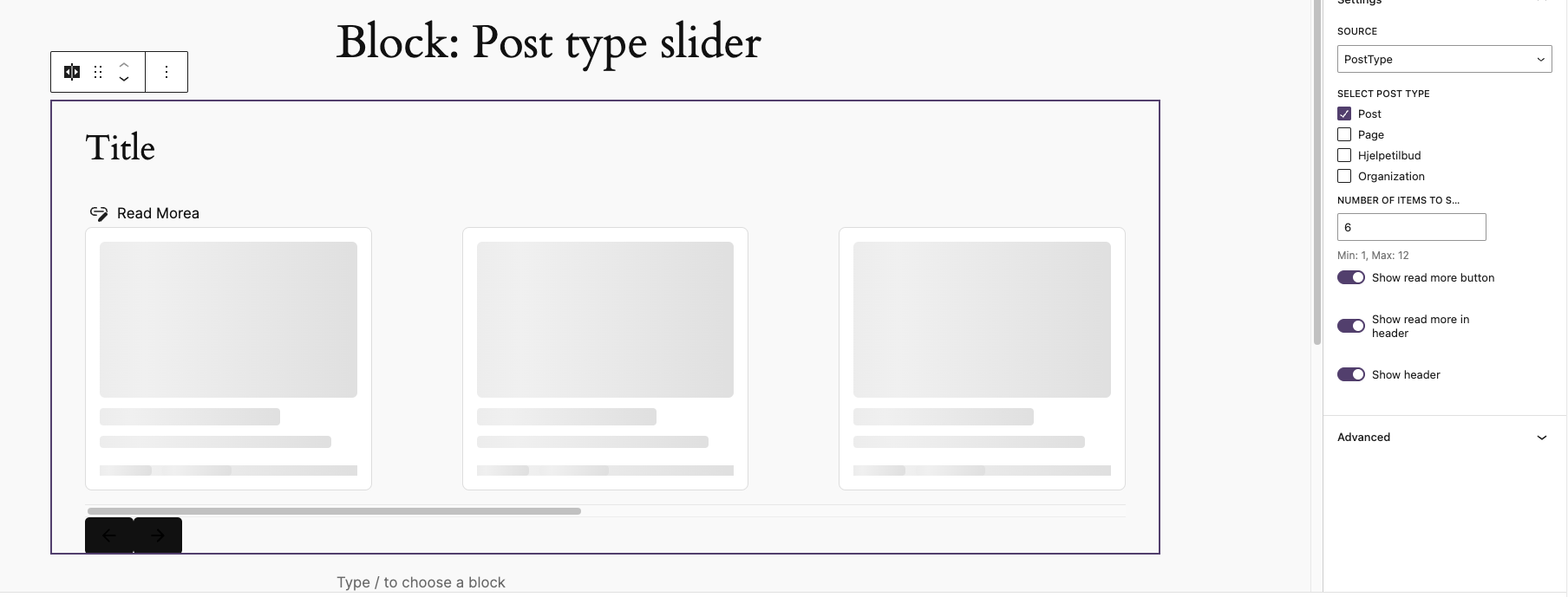
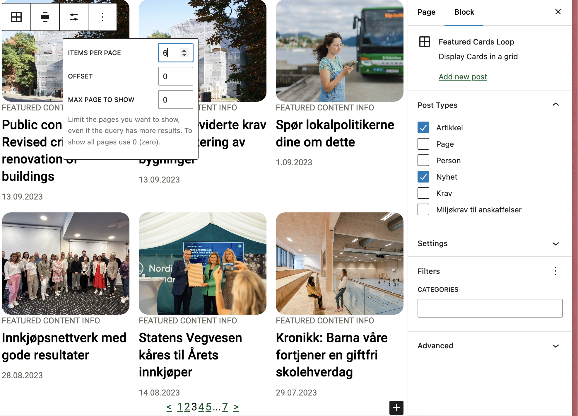
Overrides the query loop block to work with T2 while also removing clutter. Supports multiple post types. Customizable through library.json.
Customizing the block
This block can be customized using the library.json file. The following options are available:
__experimentalMultiplePostTypes (bool): Whether to allow multiple post types. Default: false.
template (array): The innerblocks template.
allowedControls (array): The allowed controls for the block See list, To see the post per page use postCount to see full list of available controls see the code as documentation is not complete Link
defaultQuery (array): The default query for the block.
defaultVariationTitle (string): The title that will be outputted for the block.
defaultVariationDescription (string): The description that will be outputted for the block.
allowedColumns (array): The allowed columns for the block.
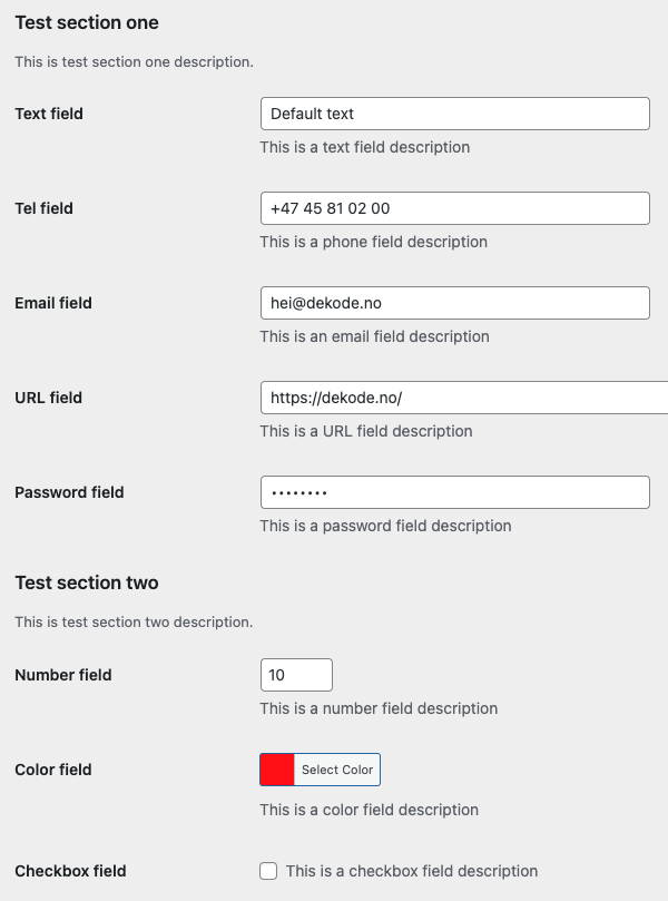
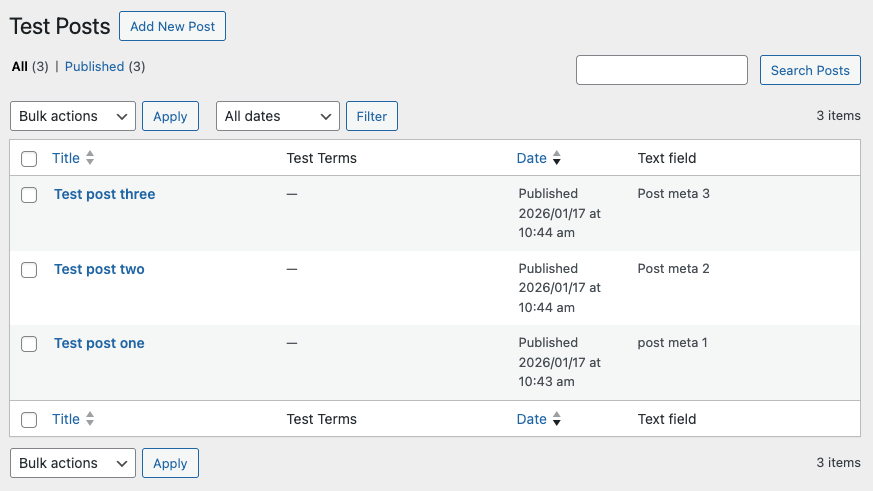
This plugin generates admin page fields and admin table columns from registered post meta, term meta, user meta and settings in WordPress. All you need to do is to add a field or column property when registering meta or setting keys with the native WordPress functions.
A WordPress plugin that provides blocks and block variations for rendering post properties, term properties, and meta fields directly in the block editor and on the front end. Per Egil Roksvaag is the owner of this plugin and responsible for maintenance and support.
Reason Why
WordPress ships with a set of post blocks (core/post-title, core/post-excerpt, core/post-featured-image, etc.) and a similar set of term blocks (core/term-name, core/term-description, core/term-archive-link, etc.). Use these core blocks whenever they cover your needs.
However, there are some cases where the core blocks fall short and you need enhanced features for displaying post, term or meta data:
Meta fields — Display registered post or term meta fields.
Additional properties — Show post and term properties not covered by core blocks, e.g. post type, post status or taxonomy name.
Display a post’s terms — Show term properties related to the current post in a term query loop or a single post template.
Display a term’s posts — Show post properties related to the current term in a term query loop or a single term template.
Post or term buttons — Render a post, term or meta field as a core button with dynamic text and link.
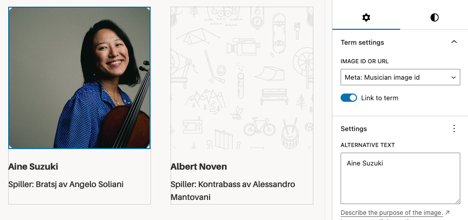
Post or term images — Render a post, term or meta field as a core image. In contrast to the core featured image block, it can display a fallback image when no featured image is set.
Filters and hooks — Backend and editor hooks for displaying custom properties or modifying the output.
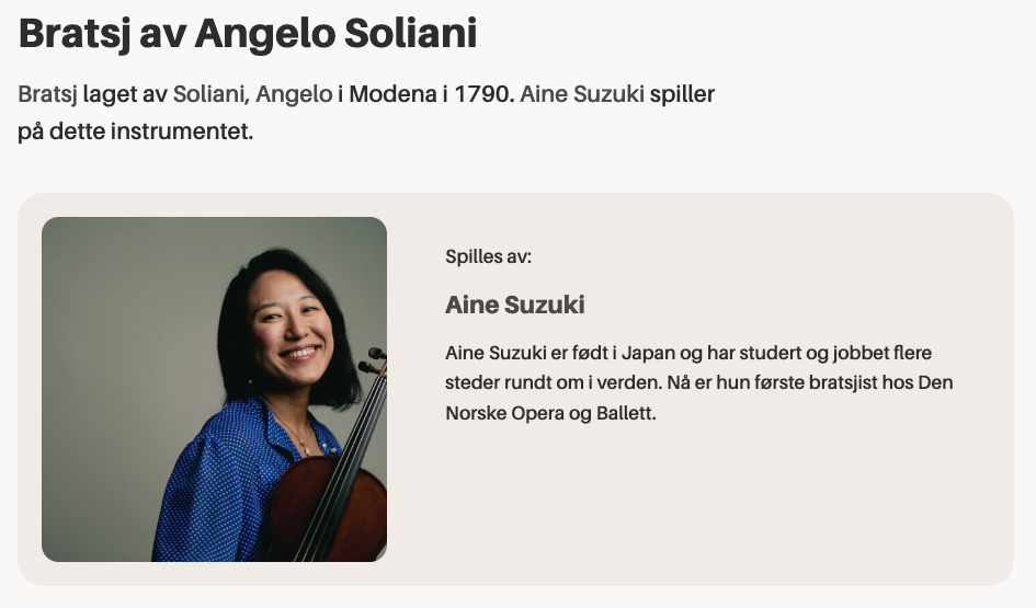
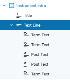
This plugin also provides a Text Group helper block for combining multiple post or term properties into a single line of text. Inside the group, you can use the included Inline Text block to insert static text or separators between the dynamic properties.
Blocks and Variations
dekode-library/post-property-text
Renders a single post property — title, excerpt, date, author, type, status, slug, link, featured image ID, or any meta field — as text. Supports prefix, suffix, separator, tag name, text alignment, and optional linking to the post. Server-side rendered.
dekode-library/term-property-text
Renders a single term property — name, description, archive link, slug, ID, count, taxonomy name, or any meta field — as text. Supports prefix, suffix, separator, tag name, text alignment, and optional linking to the term archive. Server-side rendered.
dekode-library/text-group
A layout container block for grouping multiple text property blocks. Supports inline and block layouts with configurable gap. Inner inline-text blocks can be nested freely within the group.
core/button — Post Property and Term Property variations
Two variations of the core Button block that replace button text and the link URL with a resolved post or term property. The button text and link are rewritten server-side via WP_HTML_Tag_Processor, preserving all block markup and editor styles.
core/image — Post Property and Term Property variations
Two variations of the core Image block that replace the image source with a resolved post or term property (e.g. featured_media or a meta URL field). Server-side rendered.
A WordPress plugin for discovering, configuring, and enforcing Content-Security-Policy headers. Built for WordPress 6.4+ and PHP 8.1+.
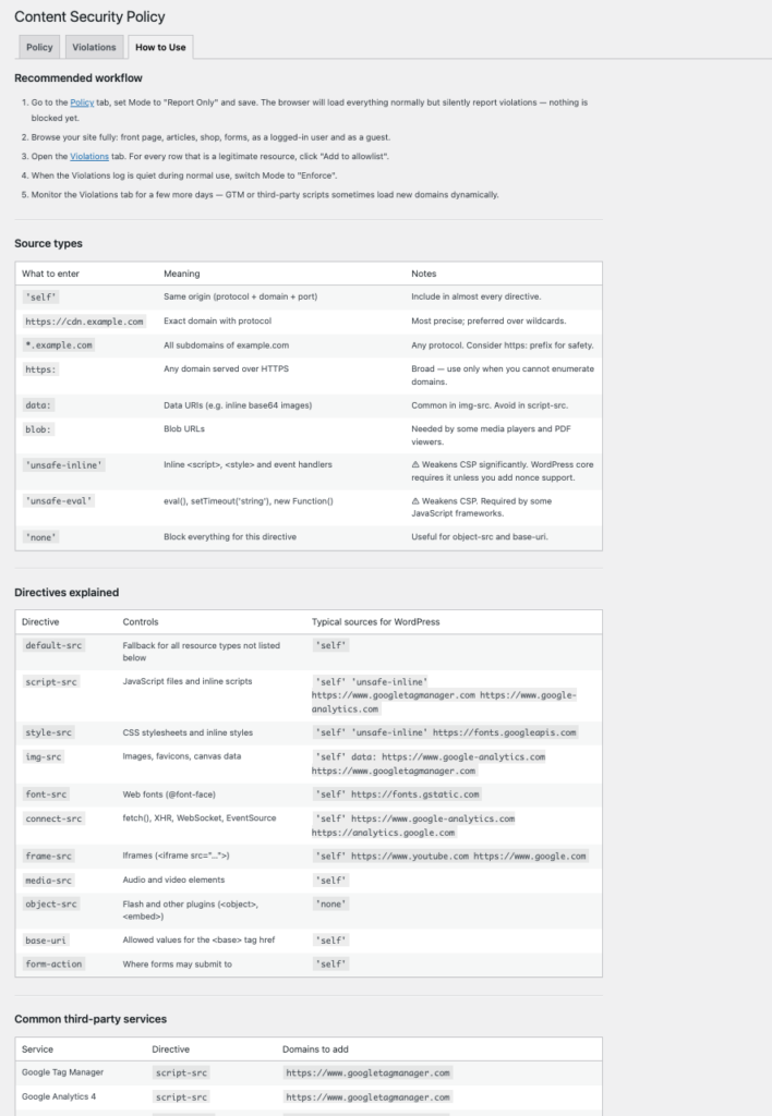
The plugin can be used for discovering and tightening an existing policy, or as a starting point for new projects. It emits both Content-Security-Policy-Report-Only and Content-Security-Policy headers so you can test in Report Only mode before enforcing.
Important! Running in discovery mode on a live site will check every resource against the policy and may generate a large number of violation reports, and could significantly impact performance of the page. Use with caution on high-traffic sites. Prefferably run it for short periods of time whe needed.
Features
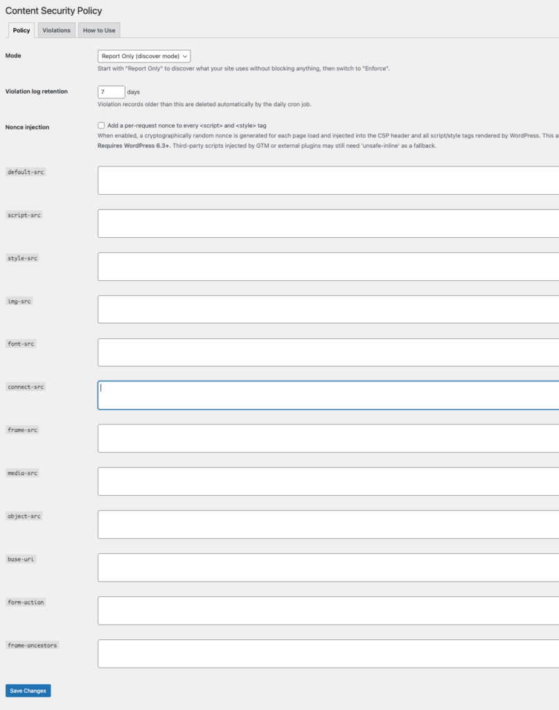
Three modes — Disabled, Report Only (discover mode), and Enforce.
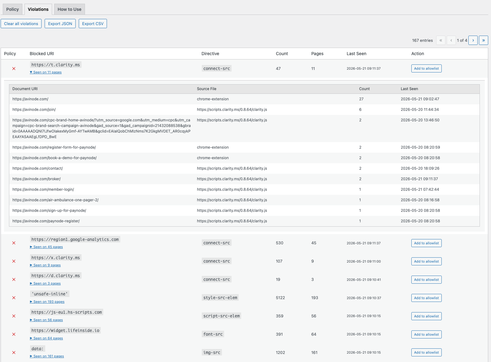
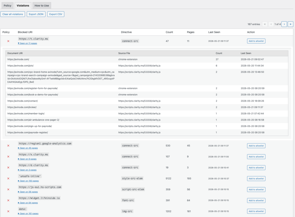
Violation log — Browsers report blocked resources to a REST endpoint; violations are stored in a custom DB table, grouped by origin and directive, and displayed in the admin UI.
Add to allowlist — One click adds the blocked origin to the correct directive in your policy.
Reporting API support — Emits both report-uri (legacy, Safari ≤15 fallback) and report-to csp-endpoint (modern batched Reporting API) so browsers buffer and batch violation reports instead of sending one HTTP request per violation.
Nonce injection — Optionally generates a per-request cryptographic nonce, injects it into the CSP header, and adds it to every <script> and <style> tag rendered by WordPress core APIs (requires WP 6.3+).
strict-dynamic support — Optional. When nonces are enabled, 'strict-dynamic' can be injected into script-src so scripts loaded by nonce-bearing scripts (e.g. GTM tags) are also trusted by modern browsers.
Violation retention — Configurable retention period (1-365 days). Automatic daily cleanup via WP-Cron. Cleanup only runs in Report Only mode — in Enforce mode violations are preserved as a rollback audit trail.
Export — Download violation log as JSON or CSV.
Safe defaults — A fresh install ships with a broad but valid starting policy (see Default policy) so Report Only mode produces meaningful reports immediately.