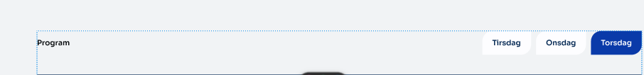
Tabs Block
Display related content in a compact tab. Originally forked out of T2.
Features
- Tabbed content navigation with accessibility support (ARIA attributes, keyboard navigation)
- Customizable prefix and suffix headings (H1-H6)
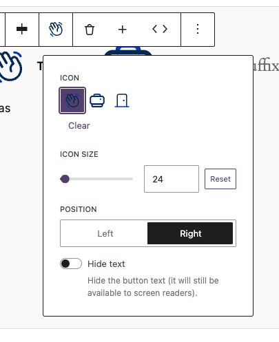
- Icon support for individual tabs with size and position controls
- Flexible tab button alignment (left, center, right)
- Configurable allowed blocks within tab panels
- Screen reader-friendly icon-only mode
Library.json
{
	"dekode-library/tabs": {
		"template": [
			["core/paragraph"]
		],
		"allowedBlocks": ["core/paragraph", "t2/link-list"],
		"features": {
			"allowTabsPrefix": true,
			"allowTabsSuffix": true,
			"allowChangingTabsJustification": true,
			"allowIcons": true,
			"allowIconSize": true,
			"allowIconPosition": true,
			"defaultIcon": "arrow-right",
			"defaultIconSize": 24,
			"defaultIconPosition": "left"
		}
	}
}
Configuration Options
Basic Settings
template– Default template for new tabsallowedBlocks– Allowed blocks inside each tab paneljustifyTabs– Alignment: left / center / right
Feature Flags
allowTabsPrefix– Enable prefix headingallowTabsSuffix– Enable suffix headingallowChangingTabsJustification– Enable alignment control
Icon Settings
allowIcons– Enable iconsallowIconSize– Enable icon size controlallowIconPosition– Enable left/right positiondefaultIcon– Default icon slugdefaultIconSize– Default sizedefaultIconPosition– Default position
Block Attributes
Tabs Block (Parent)
headingLeveltabsPrefixtabsSuffixjustifyTabs
Tab Inner Content (Child)
iconiconSizeiconPositionhideText
Usage Examples
Basic Tabs
{
	"dekode-library/tabs": {
		"template": [["core/paragraph"]]
	}
}
Tabs with Prefix and Suffix
You can add a prefix like “Choose a topic:” and suffix like “More info below”.
{
	"dekode-library/tabs": {
		"features": {
			"allowTabsPrefix": true,
			"allowTabsSuffix": true
		}
	}
}
Tabs with Icons
{
	"dekode-library/tabs": {
		"features": {
			"allowIcons": true,
			"defaultIcon": "arrow-right"
		}
	}
}
Full Configuration
{
	"dekode-library/tabs": {
		"template": [
			["core/paragraph"],
			["core/heading", { "level": 3 }]
		],
		"allowedBlocks": ["core/paragraph", "core/heading", "core/image"],
		"justifyTabs": "center",
		"features": {
			"allowTabsPrefix": true,
			"allowTabsSuffix": true,
			"allowIcons": true,
			"defaultIcon": "check"
		}
	}
}
CSS Classes
.dekode-library-tabs.tabs-position-{left|center|right}.has-prefix.has-suffix
Frontend Hook
document.addEventListener('onLibraryTabChange', function(event) {
	console.log(event.detail);
});Foo
Bar