Lorem ipsum dolor sit amet, consectetur adipiscing elit. Etiam cursus consequat enim, eu rhoncus nibh. Praesent tempor ex elit, eget finibus nibh maximus ac. Donec vehicula ultrices augue, ac efficitur tortor.
Load iframe on demand – Iframes are no longer added to the HTML, they are embedded only when user click button, reducing loads
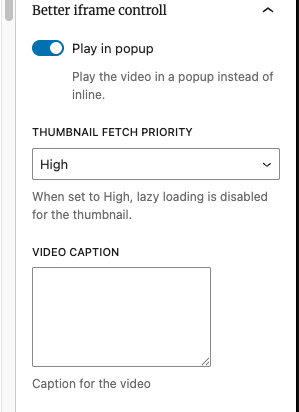
Fetch priority for thumb, when iframe is placed on top of the page it is important to set fetch priority to avoid bad LCP. This plugin allows to do this
By default plugin will fetch the thumb from YT/Vimeo and Dailymotion, but user can set their own.
Video caption – this is text displayed below (if not styled differently)
Customization
The block contains few PHP hooks for customization e.g for button if needed, all of which is described in [readme.md]
NOTE: Plugin haven’t been tested with Dekode GTM iFrame CookieBot blocking feature yet! So may not “block” iframes as expected.
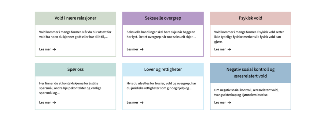
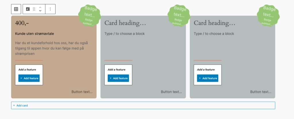
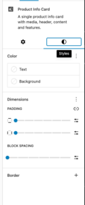
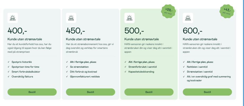
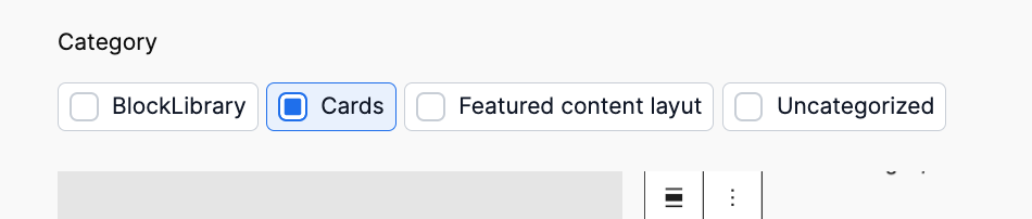
Cards allow set custom colors, support for native blogGap, and custom Featured card color per card.
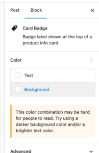
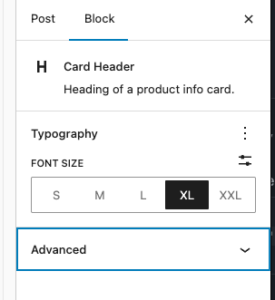
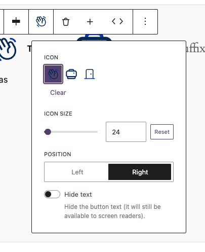
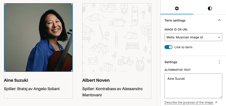
Each element suport many of native controls form wordpress, e.g You’re able to change badge color using native bg select.
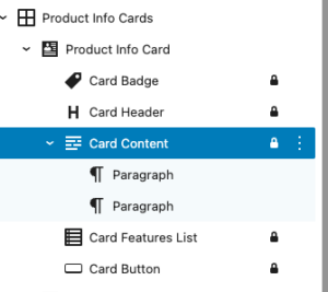
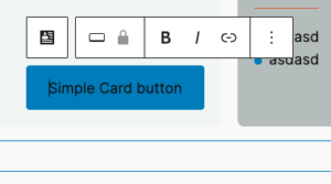
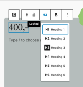
Each element in card is an inner locked block which allows easy override for block and hooking into it in case it is needed.
Editor
Design in Neas
Mobile carousel: At viewport widths ≤ 640 px the grid automatically becomes a Swiper carousel — one card visible at a time with pagination dots and prev/next arrows. The carousel is initialised on DOMContentLoaded and re-evaluated on window resize (debounced 150 ms): it is destroyed when the viewport exceeds 640 px and re-created when it drops back below. Requires at least 2 cards in the block. Swiper parameters can be customised via the dekode-library/product-info-cards/swiper-config PHP filter.
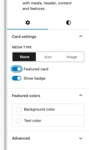
Featured card toggle with custom background/text colour
Media type selector: none | image(icon reserved for future use)
The features can be show/hidden and adjust using library.json
dekode-library/product-info-cards
Key
Type
Default
Description
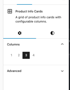
layout.defaultColumns
number
3
Initial column count applied on first block insertion
layout.columns
number[]
[1,2,3,4]
Which column options appear in the inspector
dekode-library/product-info-card
Key
Type
Default
Description
features.allowBadge
boolean
true
Show the badge toggle in the inspector. When false the badge sub-block is never inserted
features.featuredColors
boolean
true
Show the Featured colours panel in the inspector
features.mediaType
string[]
["none","icon","image"]
Restrict available media type options. A single-item array forces that type silently on first insertion
layout.imageSize
string
"large"
WordPress image size used when rendering the card media image. Any registered size name is accepted (e.g. "medium", "full", "my_custom_size"). Can be further overridden by the dekode-library/product-info-cards/card-media/image/size PHP filter
layout.iconSize
number
32
Size in pixels for the card media icon (T2 icon). Can be further overridden by the dekode-library/product-info-cards/card-media/icon/size PHP filter
settings.colors.featuredBackgroundColor
string | object
null
Default featured background. Plain string (hex/css), or { "color": "#hex" } / { "slug": "preset-slug" }
settings.colors.featuredTextColor
string | object
null
Default featured text colour. Same format as above
Lorem ipsum dolor sit amet, consectetur adipiscing elit. Etiam cursus consequat enim, eu rhoncus nibh. Praesent tempor ex elit, eget finibus nibh maximus ac. Donec vehicula ultrices augue, ac efficitur tortor.
T2 Facta
The block is slightly different.
Facta
Lorem ipsum dolor sit amet, consectetur adipiscing elit. Etiam cursus consequat enim, eu rhoncus nibh. Praesent tempor ex elit, eget finibus nibh maximus ac. Donec vehicula ultrices augue, ac efficitur tortor.
Lorem ipsum dolor sit amet, consectetur adipiscing elit. Etiam cursus consequat enim, eu rhoncus nibh. Praesent tempor ex elit, eget finibus nibh maximus ac. Donec vehicula ultrices augue, ac efficitur tortor.
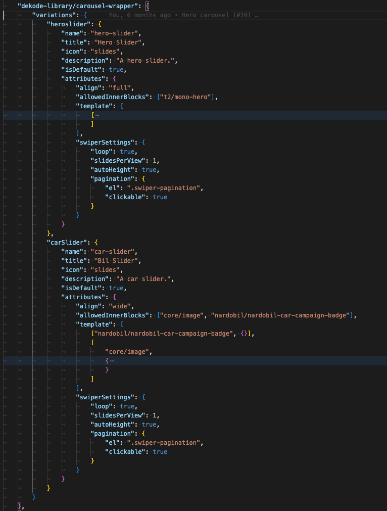
A wrapper block to make an easy carousel with your desired inner blocks. It will make a wrapper block, a slide block and then you can choose the innerblock. It will automatically add swiper pagination and navigation. The navigation buttons is the t2 chevron left and right.
Note: This is a very barebone style block, and you will need to style it yourself. It will just generate the functionality.
Define in your theme.json what inner blocks you want to allow and what the default template should be. If you want multiple carousels with different innerblocks you can create a blockVariation, and define the values in the carousel-wrapper block attributes.
Everything you define in the block attributes will override the theme.json settings.
The UX
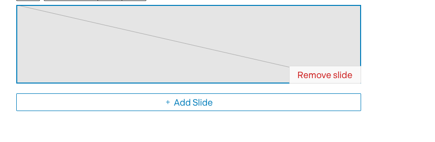
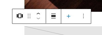
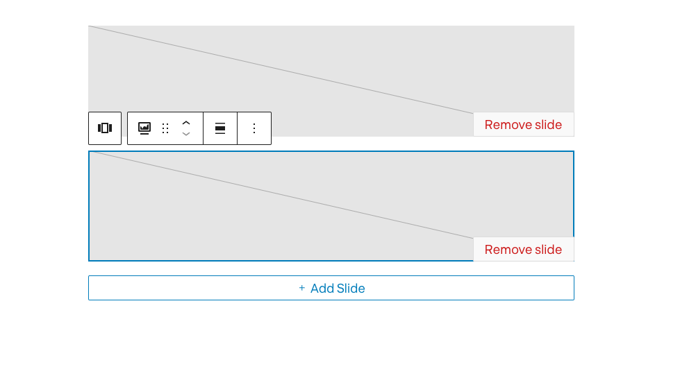
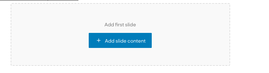
UI is simply optimized to show add/remove slide when focused.
The wrapper has easy to access ADD next slide button
Carousel only when focused will show the all slides.
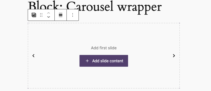
When no slides are available there is a screen to add first slide:
Variations
The carousel support register variation from theme.json.
Each variation can have it’s own unique features/settings.
Each variation will have extra class to hook styling.
This way you can have multiple unqie sliders on one page using single block.
The variation’s settings are read from library.json not from attributes, which make it easy to change later if there is need to.
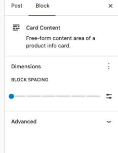
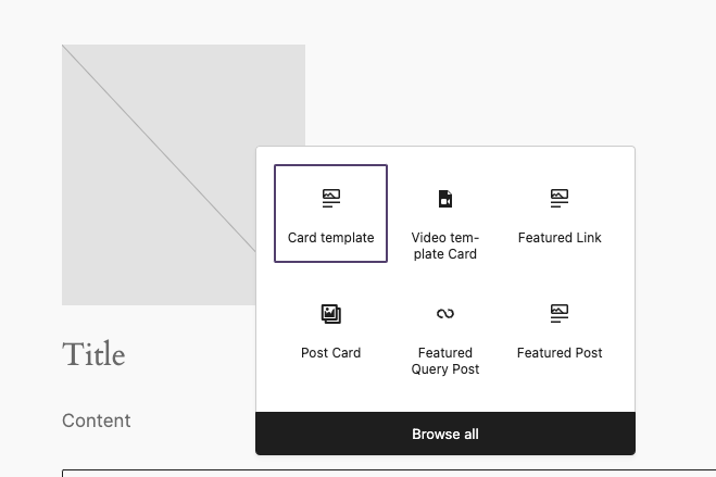
A simple card wrapper that allow to add custom content inside a card. The idea is to simplify the process of creating a card block with a predefined layout.
By default, the block block does not have any styling.