There is no dedicated time for this. So I did it in spare time …
So sorry for any issue, please report in gitHub any issue if find.
All elements supports interactivity navigation.
Styling is really basics just to have something, and cover at least plug-in solutions.
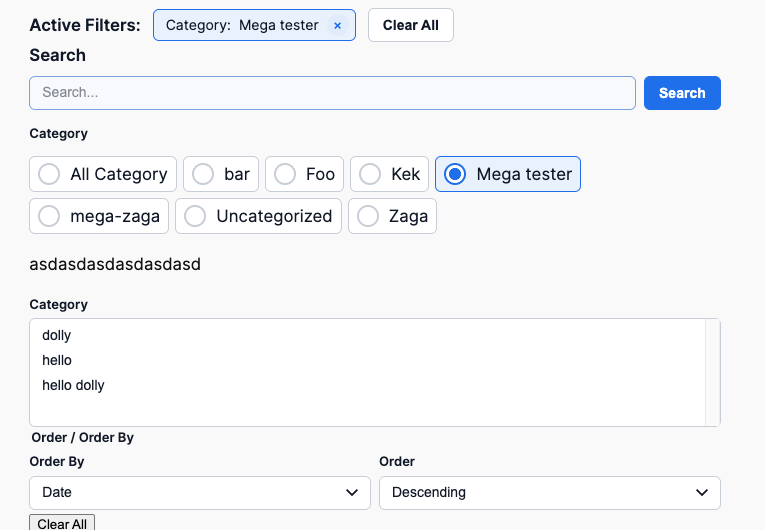
NOTE: Filters relation is AND
Key features
- Search
- Clear filters –
- It also fetch the core button regsitered styles and apply to button (outline is buggy in backed due to how WP handles it)
- Taxonomy filters
- WP Query block setting aware! – If you select some filtered categories in query it will pick only one that are selected!
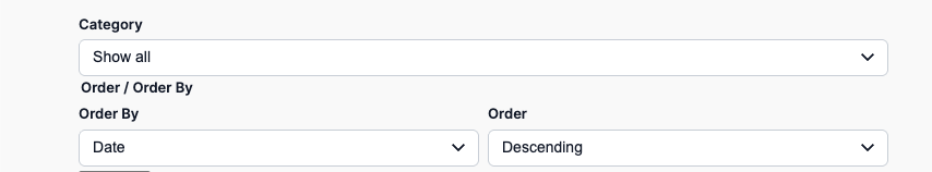
- Order
- Author
- Load more
- Button load more
- It also fetch the core button regsitered styles and apply to button (outline is buggy in backed due to how WP handles it)
- Infinity load more
- Button load more
- Chips
- Mobile collapse per filers/group filters
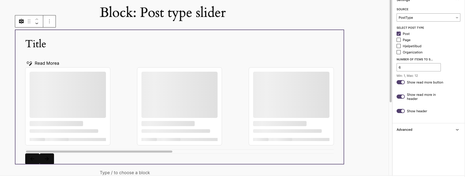
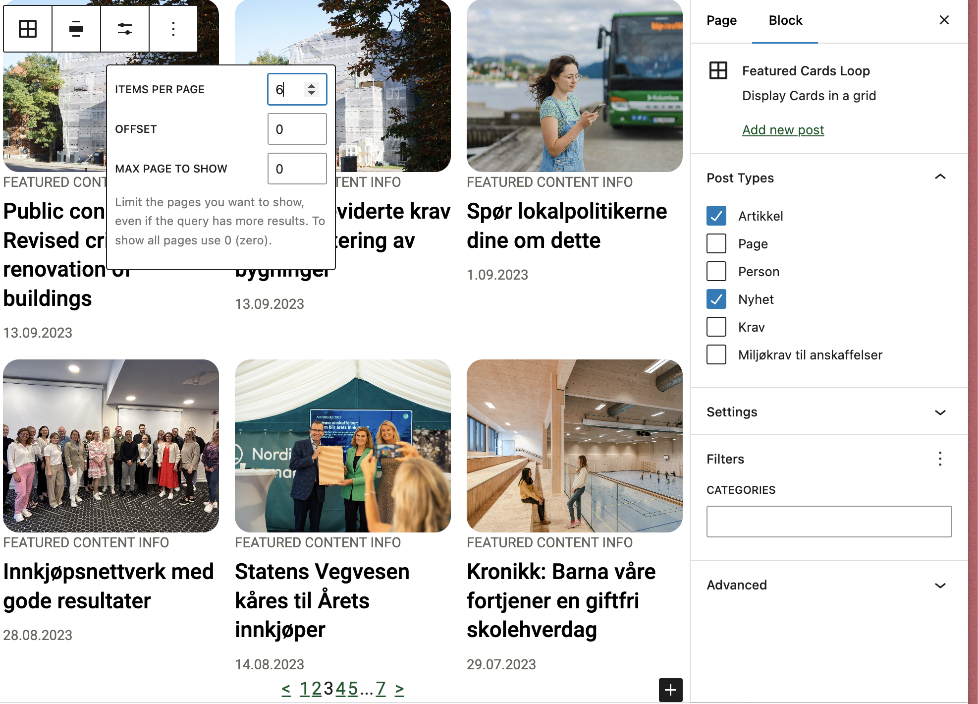
- Post type – Require Library extension to support multi-post type for query block.
- Native Interactivity API usage – so may not work with custom query block but works with WP core query.
Multiple way to display filters
- Dropdown
- Radio
- Checkbox
- Multiselect
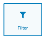
Filter
Filter can display taxonomies, post type, author and order filter.
IMPORTANT: Block will automatically fetch available taxonomy and terms (frontend)based on the current query!
Filter is a single interactive element which allows to build UI as you want.
Taxonomies loads all taxonomies from currently selected post type in the query.
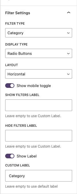
The filters type:
- Taxonomy
- Dropdown
- Radio (Vertical/horizontal)
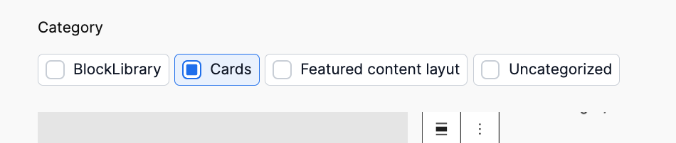
- Checkbox (Vertical/horizontal)
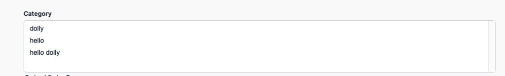
- Native multiselect – to allow hook any favorite JS here.
- Order
- Author
- Post Type – in case of multi-post type library extension usage.
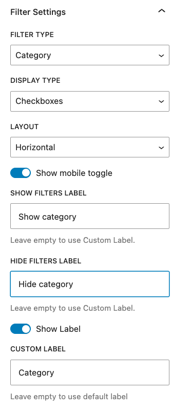
When added it asks to select filer which could be done in sidebar

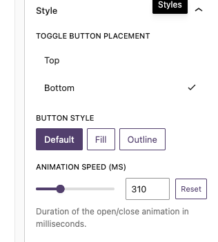
The filter in Radio/Checkbox mode can have mobile toggle filter – this is for hide/close the filter to not take too much space
Editor:
Basic frontend:
Cehckbox
Radio:

Dropdown:
Multiselect:
Filters

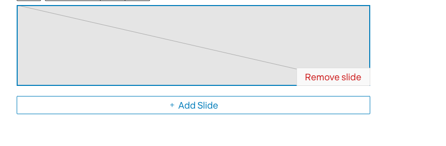
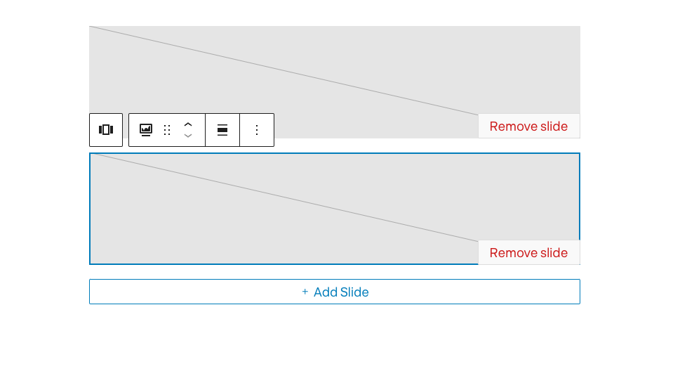
This block allows to add inner block:
- Query Single filter
- Query Clear filters
- Query Chips
- Query Search
- Core filters count
- Core paragraph
- Core Heading
The purpose is to allow grouping the filters to have one global collapse on mobile
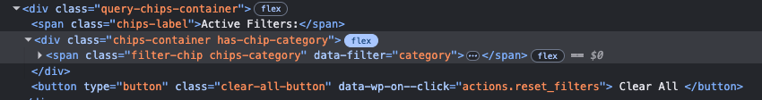
Chips
Show currently applied filters
Each element has class type of taxonomy/data-type so can be easy styled per taxonomy or type.

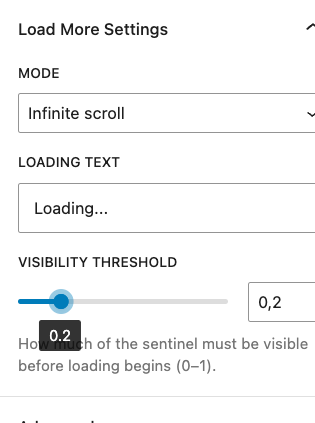
Load more/Infinity load
This block should not be used with pagination block! Remove it if exists!
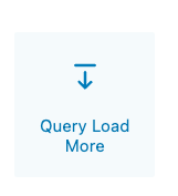
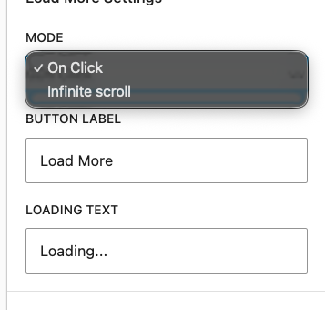
Adds load more functionality. Not there is no align settings for button – sorry 😀
Infinity load has option for treshold load
Search

Custom search for query to make it work and don’t realy on standard search – intentionally to not create any side effects.


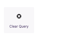
Clear filters
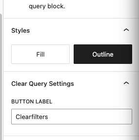
Adds button to clear filters -visible only when there are filters applied.
Example usage
The filters